Tuesday, June 15, 2010

final narrative

This is my final narrative what i was trying to show with these images was a story of myself. Starting with the first picture of me as a baby; in this picture i have me starting off as i was born to play basketball ever since i was little. things that i had used was a basketball goal a basketball, a trophy and my pass to the national champions. I was trying to represent a dream. little kids always say what they want to be when they grow up well this was what i pictured. My background was of the tennessee basketball court i chose it because i have always wanted to play for Pat Sumitt and Tenn. was my favorite team so i figured it would be a good background. The tools i used alot of it was cropping the pictures i did have from the original background and doing an overlay with some of the pictures and adjusting the color balance and the brightness of some. With the background i also added a big basketball and did an overlay to blend alot of it in, but the main focus of the picture that i wanted to catch the viewers eye was the baby. with the second picture i was trying to go for a hindu goddess theme that had arms coming out of her body and the reason for this i was trying to get the point across that with these things you can succeed. I chose a basketball as the background as well as a basketball goal i messed with the brightness of the goal to not make it stand out as much i had taken a picture of my arm and cropped it and added it to the image and and using the transform under edit i sized and rotated it to have it look lilke its coming out of her body.


With this last picture the point that i was trying to make to follow along with the story is that she is the basketball now that its truly a part of her. for the background i added things that delt with basketball shoes trophys a basketball goals things that got her to where she finally was. With the face and making it a basketball what i did was put a basketball over the original face and then duplicted the picture of her i cropped the eyes and lips and then did a gradient affect with the ball to have it shown just half of her face and not the full head a basketball and then i just erased and worked around the edges of the mouth. i also added basketballsin her eyes to emphasize my point of the story.


Tuesday, June 8, 2010

Lorteria #5

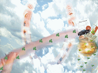
With these pictures i was trying to go along with the game lorteria. Its a game board from mexico and basically its bout chance so with my first picture what i was trying to do is have things that take chance things that i was trying to grasp for. Like my job at Baptist East hospital, very hard to get into right off the bat, so i seen myself taking a chance with that. i had bought a new car thats a big chance i added things that meant luck such as the four leaf clover, the horseshoe. I was trying to brings it as a rainbow and at the end is apot of gold. Teh tools i used well for the background i duplictaed the layer and did some cropping, i overlayed the horseshoe layer and with the eraser erased over the clouds some so you could see the horseshoe. I cut out four leaf clovers and minimzed them and put them on a trail on top of the rainbow. I had scanned my pay check and added that to the picture as well, using text since the picture was so small i added that on to the paper so you could understand where i was coming from. I blended in the money with a soft brush eraser, to make it look like its coming out if the pot.

With this picture i was trying to the bad part of chance for me i took the chance of having a car and got in wreck so a all the money i worked for went towards paying the car and it was consequence for that chance. For the background what i did was have dark grey skies. i then overlayed it with broken glass to kind of represent where i was coming from, as being shattered and hurt. i thne took a picture of y eye and cropped it and added it to the picture, i lightened up the outside of the eye to blend it in messed with the color balance to not have it so bright. I had a picture of money and what i did was take the eraser and go down the middle of ti liek it was ripped. Kind of meaning all that i earned was taken away because of the wreck. I had taken a picture of the wrecked car and cropped it and added it into the picture i changed the overlay doing a hard layer, and chnaged the brightness of it. with these two pictures i was really trying to get to different purposes of chance you have the good and the bad of it.

Monday, June 7, 2010

Surrealism #4

this assignment we were suppost to create pictures that depicted surrealism so for my first photo what i was trying to accomplish was a house floating in the sky the techiniques that i used was i used a sky for the background, but duplictaed it three times and on each layer i changed the color balance of it to make it darker as you follow the picture down. Next i had taken a picture of my oms place and this picture was taken later in the evening so i changed the brightness of the picture and lightened it up. the next thing i did was add waterfalls that i had pictures of to each side of the house and added some flowers to attract your eye to them. I also had use the smudge tool and dragged out the bottom of the waterfall to make it comeover the floating ground itseelf like it was fallig into the sky i added little colors of stars so kind of give it a magical affect. for the bottom of the ground that the house is sitting on i actually used a picture of mountians to kind of give the effect of use yuor imagination type thing. and i turned it upside down and faded and messed with the color balance to give it the look it has.


For this picture i combined to types of pictures a waterfall and a creek, i wanted to give the effect of the waterfall calming down and like flowing into a stream i added the sky background from a clipping of another picture. I did the lgithing effect in the cormer to kind of show a contrast of light in the picture with shadows and stuff coming off the octupus. I added some flowers and a butterfly. what really tops this picture off is the octupus in the water i did the cloning stamp and added water coming off of the octupus like its coming out of the water to give it a surreal effect.

Thursday, May 27, 2010

Derrick and I

Just for fun
My boyfriend and I

Tuesday, May 25, 2010

Assignment #3 Life


The word i had chosen was Life, the synonym was energy that i had picked with this picture i was really wanting the color to stand out and the brightness of it as well. As my background i had chose a picture of boiling water from texturevault a website given to us. The things i added was a basketball goal because to me i have energy playing basketball so i felt that it went along with meaning of the word. I also added a picture of my arms looking to show that im dunking the basketball, i put emphasis on the basketball and had flames comeing from it to show that all the energy that i used was exerted into the basketball. for the word energy i used a weird font to kind of give it a catch didnt want soemthing that was to normal and plain. i gave it the red color to go along with the background and as for the background of the word i had chose a picture of broken glass and with the color gredient i messed around with the color to have it stand out. With the smudgeing tool and using a soft brush i fanned out the edges of the glass into the boiling water to make it blend in more.


My antonym that i chose was death with this picture i literally wanted to empahsis what the word actually means so i had taken a picture of a cemetary and added that to the bottom of the picture. As for my background i went to texturevault and found a stormy clouds as making it more of a gloomy setting. i added a mauseloum to the picture and using the eraser with a soft touch i added a fog affect to make it look more creepy. I added the tree to go along with the mauseloum as if the setting was fit altogether in a cemetary like in a movie. i added the skull and had that faded into the clouds. To finish off with everything to me i added bobwire to give the effect of dangerous creepy picture.


Tuesday, May 18, 2010

Fortune cookie Assignment 2


For my fortune cookie it was "The path of life shall lead upwards for you." The reason i chose this fortune is because i felt like it pertained to me the most and had most meaning. The background that i chose was a country road where i use to live in Mt. Eden, i took the picture in black and white to begin with. What i added to the background was a picture of me as if i was walking up the road, along the road as i was walking up i have a basketball; the basketball represent me being focused in my life to help me get to where im going, it put me on the right path. The Spalding University sign was a way of saying that its only an up hill from here and you will have reached the top that your half way there. I also used a filter to a spot ligth to show that meaning of you wanting to go towards the light, that its a good thing to follow. I also had added a rainbow to represent a happy a sign of relief after a storm. So for me it was representing a sign of all the hard times that at the end of the path i could have satisfaction. Another thing that i added to my picture was my boyfriend who stands by me and has helped stay on the right path who is there for me and is always a helping hand. the last thing that i added was the chinese symbol life i just wanted it to represent the overall meaning of the fortune cookie. some effects that i added was the gray scale or color scale i should say, using some of the tools it enabled me to have a more of black and white affect where i was standing in the picture and lead into a more darker color going up through the picture.
This is my second picture that i designed that goes along with the fortune cookie i still used some of the same pictures and i also took some out to have more of a focus on just one thing. The main focus i wanted to use was the picture of my boyfriend in doing so i was trying to have the concept that without him the path wouldnt be so easy. what i did was made him have a screen effect to where you still see the main part of the background. The things that i did different was that i added fireworks in place of the rainbow and the spot light and gave it more of an excitement to want to get to the top of the hill. I also added a frame around the picture and changed the backgrounds lighting and saturation gave it more of a dark effect more then what the black and white already showed. Soem things that i had trouble with was trying to make the fireworks blend in better, as far as the color what i was wanting to try an obtain was at the bottom start out real dark and as you followed the picture up to the top it gets lighter and more color added to, but since it was already a black and white picture the only thing i probably could of done was added color to it little by little like i was painting.

Monday, May 17, 2010

lady among mountain side


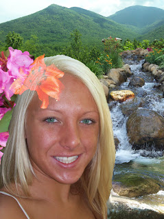
With my picture what I was trying to come across was kind of like a forest enchantment. The mountains that I used for the top part of the picture was the pictures that I took from last summer in June when I went to Tenn. What I used that really came in handy was the cropping technique is what I think of it as where you can take piece of the actual picture that you want and using another tool on photo shop you click the add button and it adds it to the picture you originally have. I did the same for the waterfall I took that picture as well in Tenn. at Gatlinburg actually along the strip of all the little malls that they have up and down the road. With it I did the same I cropped a piece of the waterfall that I wanted to add to my original picture and placed it where I wanted. The bottom piece of the waterfall was a piece that I took going up towards Cherokee village it was a little stream on the road side so I cropped it and added it to the bottom part to kind it make have the effect of it calming down into a stream and not make it look so rough as the beginning of the waterfall. On the side of the women i wanted to add some flowers to show it more of a woods type effect so I had taken a picture of some flowers in my moms backyard and just added them to the picture. With the tiger Lilly those are my favorite flower so im always taking pictures of them whenever i see them. What I was trying to do to make the women blend more into the setting of the background she was in I added that to her head but I didn't want to make it stand out to much being afraid it would take away from the rest of the picture so I did the screen fade where its still there, but it doesn't give that effect of standing out when you look at the picture. For being my first photo shop picture I wouldn't necessarily say I was satisfied, but not being familiar with all the tools and techniques of photo shop im pleased with what I had come up with. Some troubles that I had come bout was the image size of the other pictures like I was wanting to add a butterfly, but couldn't figure out how to make it smaller. Another issue that I came bout was the rotation of some things that I added when I tried to rotate it seemed to turn the hole picture itself and not the image i selected. The last issue that seemed to give me some trouble was on the women i was wanting to blend her skin in a little more and make it less shiny as to what the photo already showed, but couldn't master the concept of it. I did use the tool I think it was the stamp and the blemishing tool where it blended some parts of the skin in that I wanted to make better but as far as the whole face I didn't do.