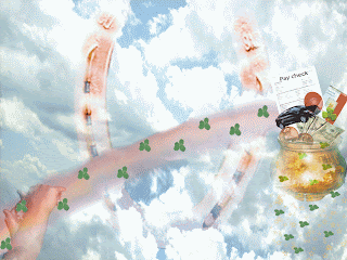
 With these pictures i was trying to go along with the game lorteria. Its a game board from mexico and basically its bout chance so with my first picture what i was trying to do is have things that take chance things that i was trying to grasp for. Like my job at Baptist East hospital, very hard to get into right off the bat, so i seen myself taking a chance with that. i had bought a new car thats a big chance i added things that meant luck such as the four leaf clover, the horseshoe. I was trying to brings it as a rainbow and at the end is apot of gold. Teh tools i used well for the background i duplictaed the layer and did some cropping, i overlayed the horseshoe layer and with the eraser erased over the clouds some so you could see the horseshoe. I cut out four leaf clovers and minimzed them and put them on a trail on top of the rainbow. I had scanned my pay check and added that to the picture as well, using text since the picture was so small i added that on to the paper so you could understand where i was coming from. I blended in the money with a soft brush eraser, to make it look like its coming out if the pot.
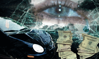
With this picture i was trying to the bad part of chance for me i took the chance of having a car and got in wreck so a all the money i worked for went towards paying the car and it was consequence for that chance. For the background what i did was have dark grey skies. i then overlayed it with broken glass to kind of represent where i was coming from, as being shattered and hurt. i thne took a picture of y eye and cropped it and added it to the picture, i lightened up the outside of the eye to blend it in messed with the color balance to not have it so bright. I had a picture of money and what i did was take the eraser and go down the middle of ti liek it was ripped. Kind of meaning all that i earned was taken away because of the wreck. I had taken a picture of the wrecked car and cropped it and added it into the picture i changed the overlay doing a hard layer, and chnaged the brightness of it. with these two pictures i was really trying to get to different purposes of chance you have the good and the bad of it.

No comments:
Post a Comment